Marketing and Visual Merchandising our Store

This blog is here as a record of our ongoing pursuit for fantastic visual merchandising and marketing in a bookstore and newsagency in regional AUSTRALIA. Let us know what you think of our work, give us some concepts, use our ideas and spread the word.

Thursday, May 6, 2010

Mum's the Word

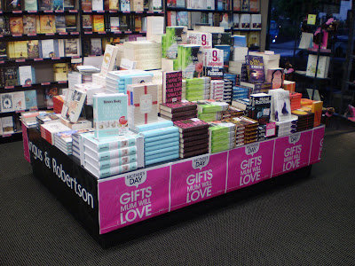
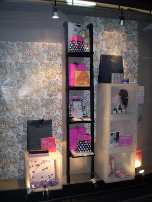
We have put together Mothers Day in a bit of a hurry.....looks pretty good though.

There is a fair amount of store product in these, a nice mix of colours and a nice overall feel.

Also included is a look at one of the book pyramids, the pink skirting works pretty well and gives the display something....not sure what, but it works alright.

I just think the ostrich feather quills are the coolest thing, its good to have them back in the store.


A New Frame


We continue to tinker with the store presentation, this time its the front of building that gets some attention.

We replaced all of the tiling surrounding the windows,the pillars and floor of the entrance. In keeping with our new look we have used layered granite tiles on the vertical faces and black slate on the floor.

Just waiting on a new Stainless Steel handrail, some more paint and a couple of finishing tiles - then the front of store will be a picture in itself.

Its remarkable how much difference just changing the "frame" makes to a picture